← BackLogo Design · 02 / Marks
LOGO DESIGN.
A mark that holds its own — drawn to outlive trends, sit calm on paper and screen, and carry a brand without leaning on it.
Case Study № 01Identity · Mark · WordmarkMMXXVI
Client
Flee Samsara
Discipline
Logo Mark
Wordmark
Identity System
Wordmark
Identity System
Year
2026
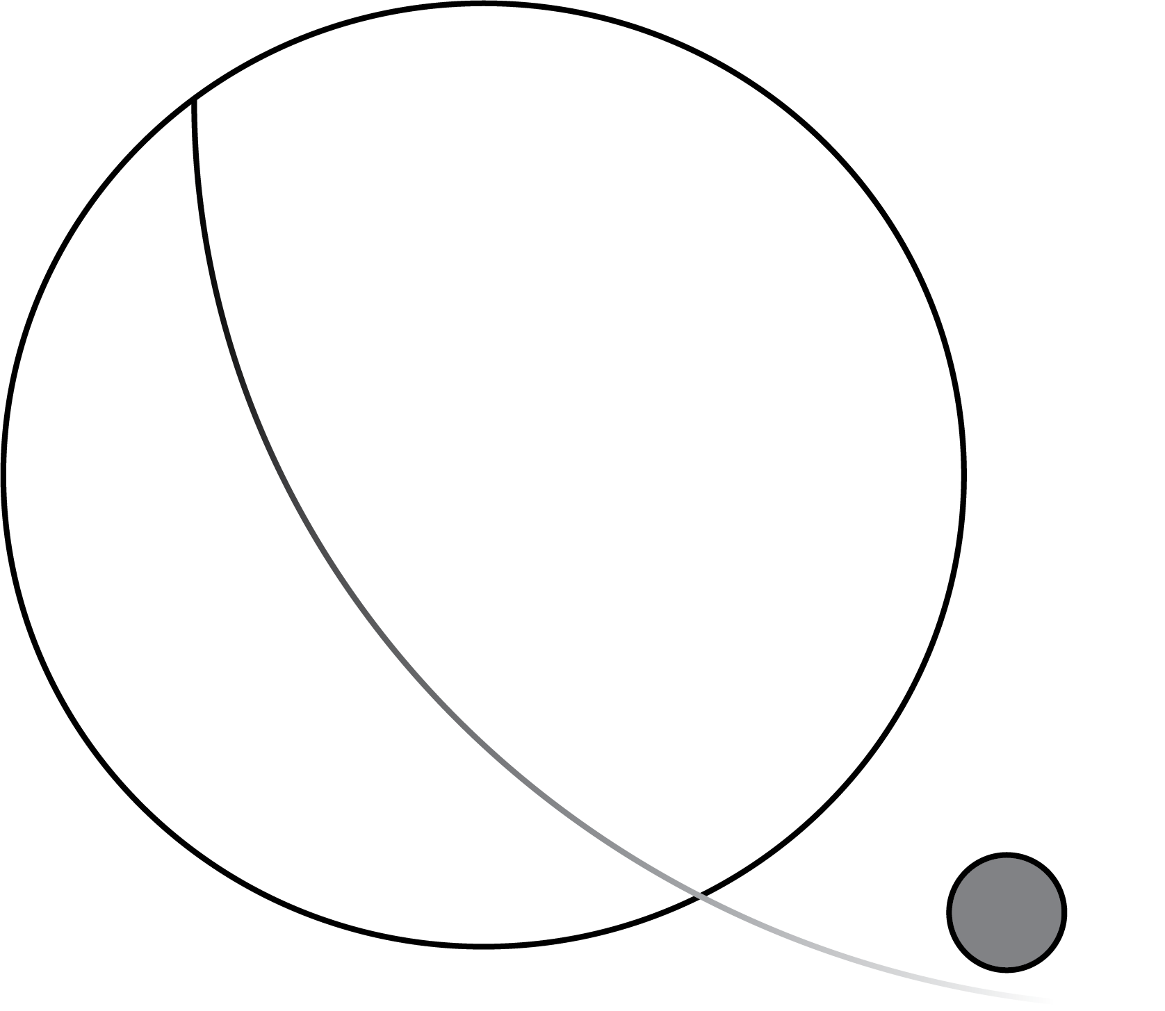
Primary Mark01 / 03
— On the mark
A single line escapes its own orbit. The circle stays whole; the small sphere drifts — composed, deliberate, free.
02 — Wordmark
Custom Serif
Drawn to hold the mark in serif composure — quiet weight, considered counters, set in a square frame for paper and screen.
Wordmark02 / 03
Mark · Vertical02 / 03
Type
Custom Serif
Palette
03 / 03
Drawn 2026Between The Lines · StudioFor studio & shop
Case Study № 02Identity · Mark · WordmarkMMXXVI
Client
Whisk
Discipline
Logo Mark
Wordmark
Tea Bar Identity
Wordmark
Tea Bar Identity
Year
2026
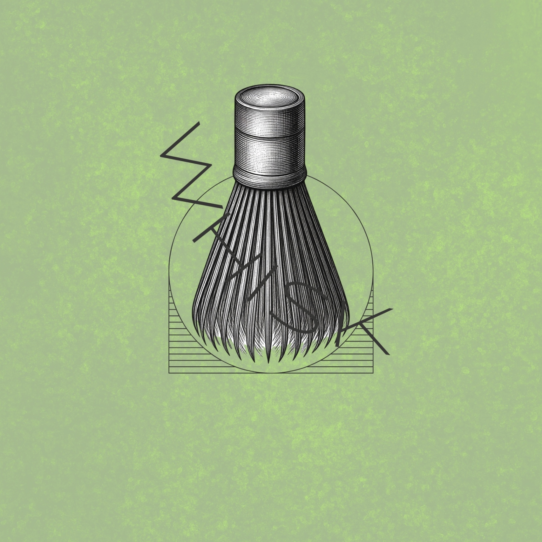
Primary Mark · Construction01 / 02
— On the ritual
The chasen meets the bowl. A quiet zig-zag — the path of the whisk through matcha — drawn as the word itself. Ceremony, distilled.
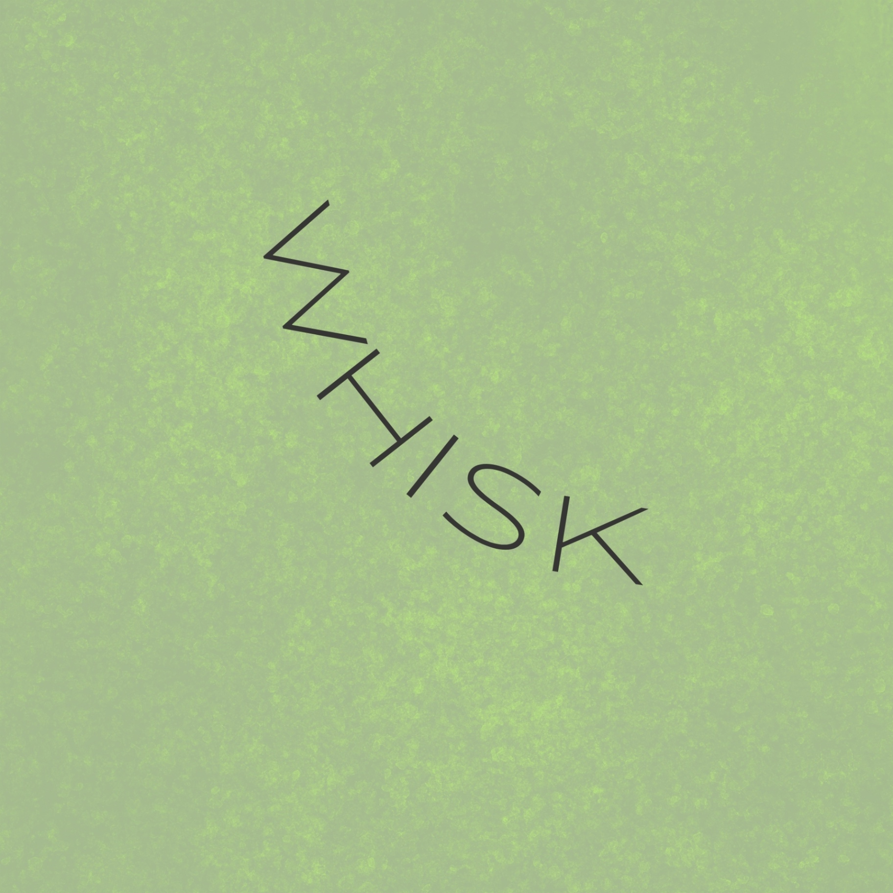
02 — Wordmark
Drawn Line
A single hairline gesture spells the name and traces the whisk's motion — sleek, modern, and stilled like the surface of tea.
Wordmark02 / 02
Drawn 2026Between The Lines · StudioFor a matcha tea bar